Is Tech Forcing Designers to Gentrify?
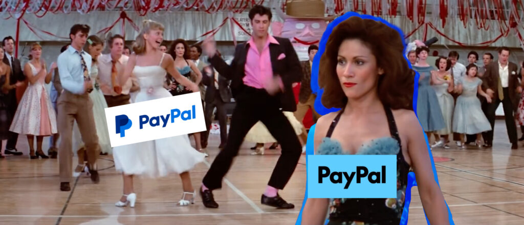
Let’s start with why I have gathered you here today: PayPal’s new rebrand. You’ve likely seen it—a fresh, streamlined wordmark that looks like they opened Word, typed “PayPal,” and hit ‘Bold.’ It’s clean, it’s simple, and it’s…well, boring. And while simplicity has its merits, you can’t help but wonder: when did all of branding start to look the same?
As someone who’s been in the branding game for years, I know the kind of blood, sweat, and caffeine that goes into a rebrand. So, who exactly is behind these increasingly common decisions to opt for ‘generic tech company font number 3’ and call it a day? Is the digital world pushing brand designers to gentrify creativity?
The Evolution of Logos: From Iconic to “Meh”
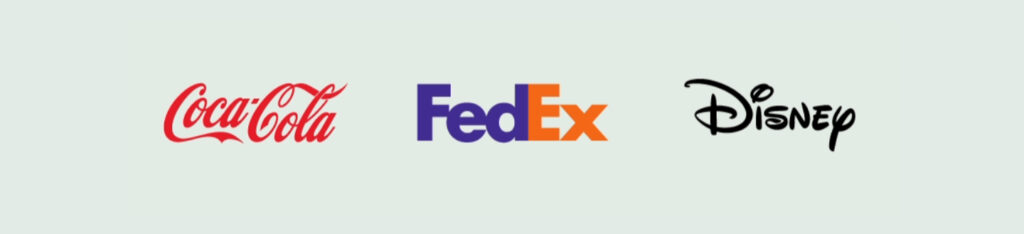
Let’s take a quick stroll down logo memory lane. There was once a time when logos had personality—when brands like Coca-Cola, with its swooping cursive wordmark, created something instantly recognizable that hasn’t needed much tweaking for over a century. Or FedEx, whose logo is one of my favorites. You know the one: the clever negative space forming an arrow between the ‘E’ and ‘x’? It’s simple yet smart, packing meaning into every stroke.
And then there’s Twitter, which (yes, I refuse to call it “X” because, well, no thanks, Elon) didn’t even need a wordmark for years. A small bird said it all. The blue bird represented connection, conversation, and simplicity in one beautifully designed symbol. So how did we get from the iconic and imaginative to…whatever this current trend is?
The Influence of the Digital Age
I get it. We’re living in an online-first world, and logo design has to keep up with the realities of digital consumption. Logos need to scale down to fit on a tiny app icon, be legible on a smartwatch, and load instantly on slow Wi-Fi. As much as it hurts, there’s a reason why overcomplicated logos don’t cut it anymore. But does that mean we need to strip all creativity out of the process?

Brands like Coca-Cola and FedEx have maintained their unique identities while adapting to the digital landscape. Yet, what we’re seeing in the tech and fintech world is a move towards minimalism that feels almost…lazy. PayPal isn’t alone in this. Look at Mastercard. They’ve done away with their overlapping circles and opted for a uninspired, lowercase wordmark.
The Gentrification of Branding
So, is this the gentrification of branding? Are we trading cleverness and originality for “safe,” streamlined designs that all blend together? It’s starting to feel that way. The irony is, in a world where companies are desperate to stand out, many are opting for designs that do exactly the opposite.
I’ve been in enough branding meetings to know that these decisions aren’t made lightly. The hours poured into rebrands are staggering, and it’s not like someone woke up at PayPal HQ one morning and said, “Let’s just pick a random font and call it a day.” But where’s the magic? The creativity? The identity?
And let’s talk about how hard it is as a brand strategist to convince clients that you know best, especially when trends are pulling them toward minimalism. I’ll be honest—it’s always been a dance. You want your client to feel ownership of their brand, but at the same time, you’re the one bringing in the experience, the vision, the ability to distill their brand into a symbol or wordmark that speaks volumes. Yet lately, it feels like the dance is being interrupted—Sandy’s all set for a rebrand, but Cha-Cha DiGregorio, a.k.a. the demands of online simplicity, keeps sliding in to steal the trophy.
Who’s to Blame?
So who’s to blame for this trend? Is it clients who are too risk-averse to go for something bold? Is it designers, worn down by the constant demands for ‘simple and clean’ logos that look good on an iPhone screen? Or is it technology itself, driving us towards a world where we need to fit into boxes (literally, like tiny app icons) that leave no room for creative exploration?
The truth is, it’s probably a mix of all three. Clients want logos that work everywhere, and designers have to balance creativity with the need for scalability and simplicity. Responsive design and digital-first thinking have led to a lot of compromises.
Final Thoughts
The art of logo design has always been about balance. It’s about creating something timeless and memorable, but also functional and versatile. But in this digital age, we can’t afford to let functionality drown out creativity. The best logos are the ones that blend both.
So, are brand designers being forced to gentrify? Maybe. But the real question is, how do we fight back? How do we reclaim the creativity that made brands like Twitter (RIP, bird), Coca-Cola, and FedEx so iconic? And more importantly, how do we all tap into our inner stubborn Taurus and convince clients that sometimes, boldness, cleverness, and a little personality are exactly what they need to stand out in a sea of sameness?